品牌日志
2026-09-23 09:35:52
Continue to Grow With New Marks
The sixth anniversary is a look back and a fresh start
In 2020, we set out under the name of "JACQUE ANGEL" for the first time. Over the past six years, we have continued to understand the relationship between originality, structure, craftsmanship and real life from one piece of work; we have gradually confirmed why we create and what kind of women we want to create for. On the occasion of our sixth anniversary, we decided to rewrite our name with a new set of brand visual identities. This is not to bid farewell to the past, but to allow the established brand position to be seen more clearly and for a longer time.
Q1| What has changed in six years?
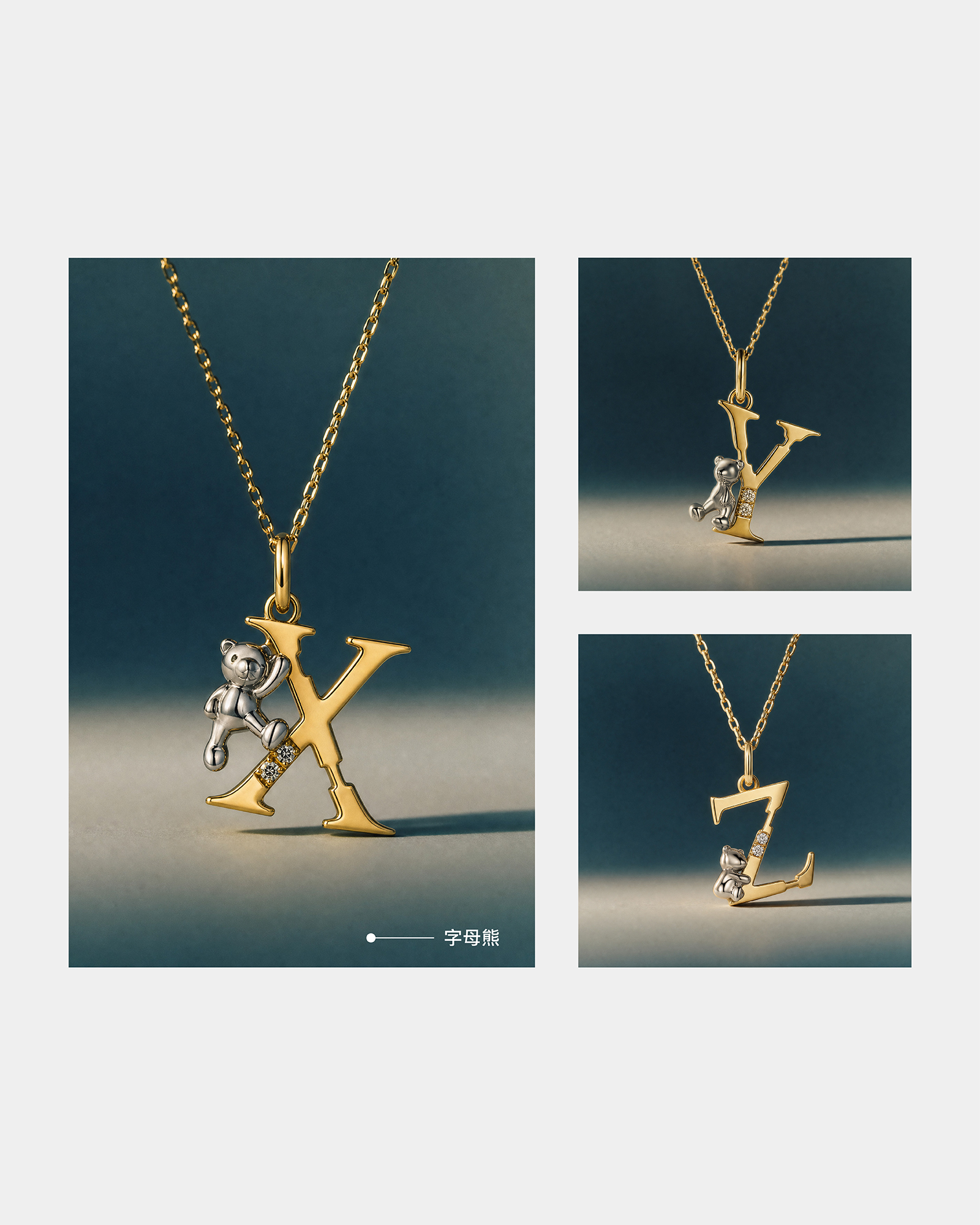
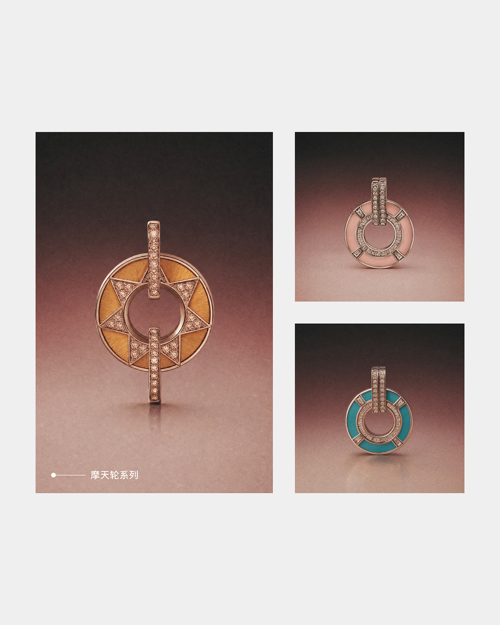
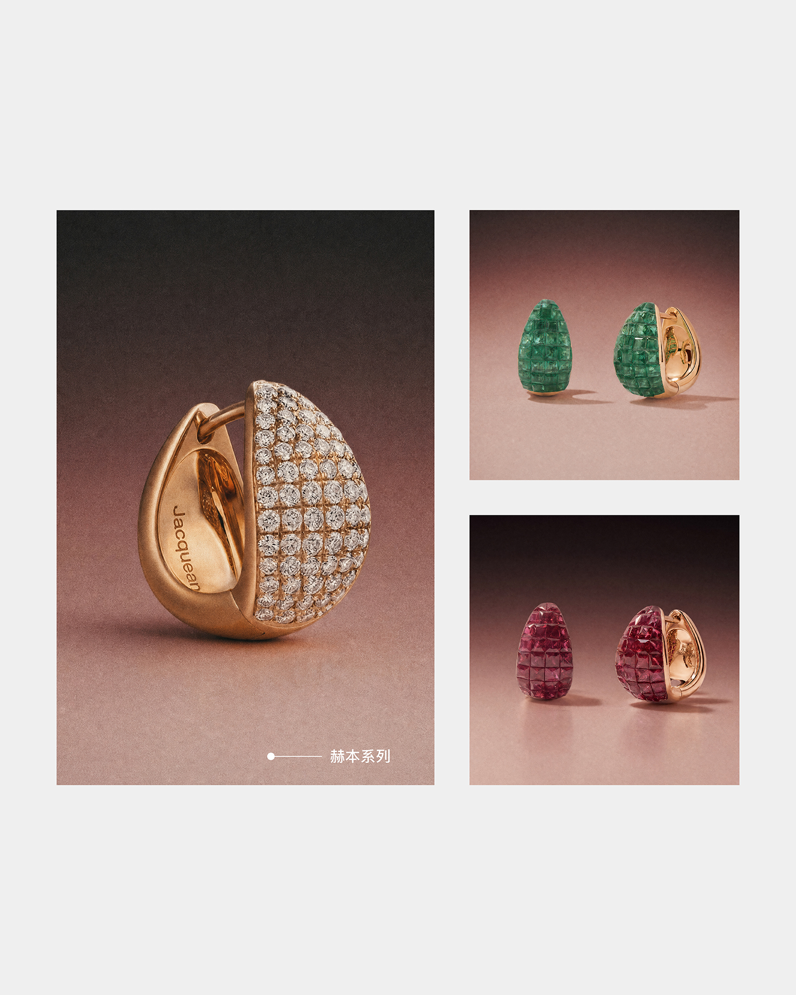
Initially, JACQUE ANGEL chose to face the market with his works first. The letter bear allows the original to be seen, the jewelry planet chain brings a multifunctional structure into daily life, Hepburn earrings have become a long-selected classic, and the Ferris wheel allows people to interact into the works. In 2024, these accumulations of originality, structure and people will have a common direction. We established this year as the first year of the brand, moving from "what products to create" to "why to create and what women we want to create for." 2020 is the starting point for the team and original works; 2024 is the starting point for the formal establishment of the brand position. Today, six years later, the two together constitute JACQUE ANGEL.
Q2| Why upgrade VI on its sixth anniversary?
The new VI is not a superficial standard change, nor does it use "more advanced and more international" as the main reason. When JACQUE ANGEL has formed her own female narrative view, product relationship, design and craft language, what visual needs to do is not only to allow people to recognize products on a page, but also to allow products, packaging, content, space and services, gradually form the same brand feeling. This upgrade is a re-expression of the brand from merchandise and store identification to long-term brand signature. It makes each appearance clearer, more consistent, and closer to today's JACQUE ANGEL.
Q3| New identification, what to keep?
JACQUE ANGEL always starts from the specific and abundant life experience of China women. We focus not only on what she wears, but also on how she feels, judges, chooses, and gradually becomes herself as she changes. A woman is not someone waiting to be decorated with jewelry, she is the source of meaning. Vitality, speculation and authorship are not the requirements that brands place on women, but to maintain visibility and respect for their already existing abilities. Therefore, new identification needs to accommodate both feelings and judgments, flow and order, temperature and boundaries. It does not depict a standard image for women, but reserves space for different life narratives.
Q4| Where do new graphics grow from?
The new graphics continue the design origin of "the Chinese character" Jie "+ water + female". "Jie" provides brand ownership and structural skeleton. Water gives graphics flow, adapt, overcome resistance and maintain their own life state despite change. The two circles are not two types of women, nor do they correspond to fixed "spirit" and "reason". Their overlap expresses that multiple experiences, roles and sounds can exist at the same time; the round boundary accommodates experiences and also confirms oneself. The central axis and horizontal structure allow flow to have judgment, while the lower asymmetrical curve allows order to retain life. It depicts not a certain female image, but how a person forms his own inner order between feelings and judgments.
Q5| What kind of JACQUE ANGEL does it want to present?
The new identification seeks clarity, restraint and stability while retaining flow, breathing and temperature. Have feelings, but do not define women by weakness; have judgments, but do not create distance by coldness; have oriental experience, but do not rely on direct reproduction of traditional symbols; have a foundation in craftsmanship, but do not use complex technology as a show off. China's female humanism does not need to be written as a set of visual slogans. The way it enters VI is to allow flow and order to exist at the same time, allow blank space to reserve space for individual experience, and allow every signature of the brand to be restrained and clear, and can be used for a long time.
Q6| What has changed besides the new logo?
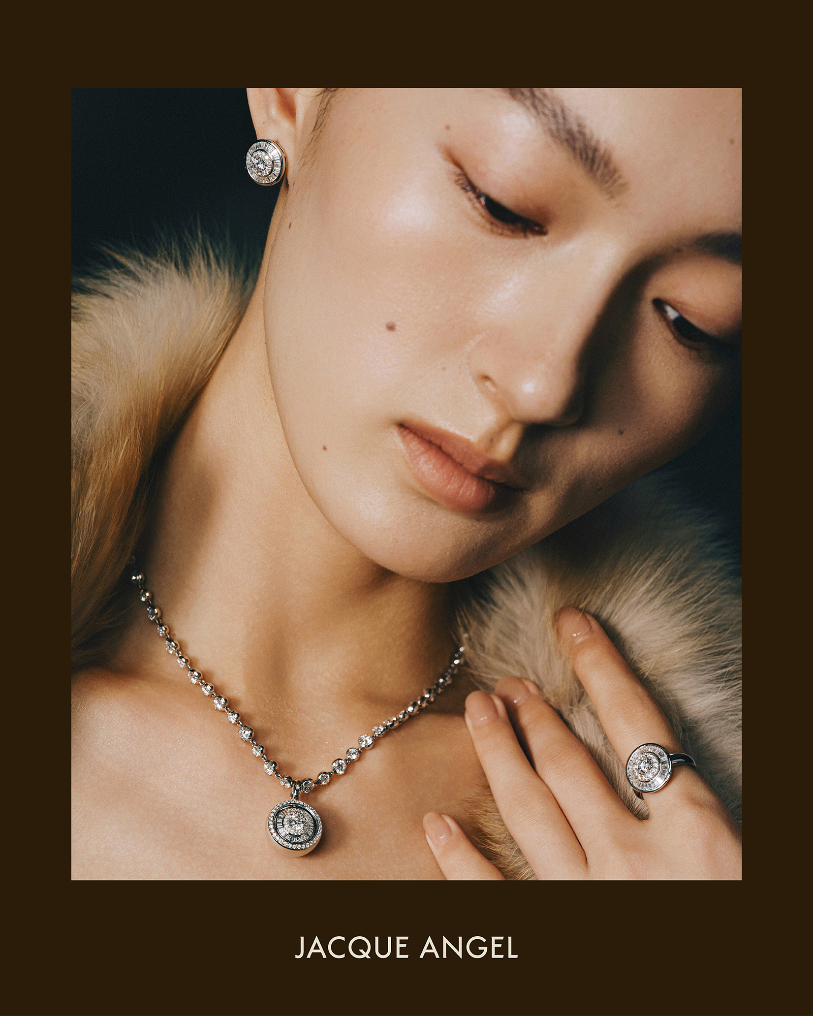
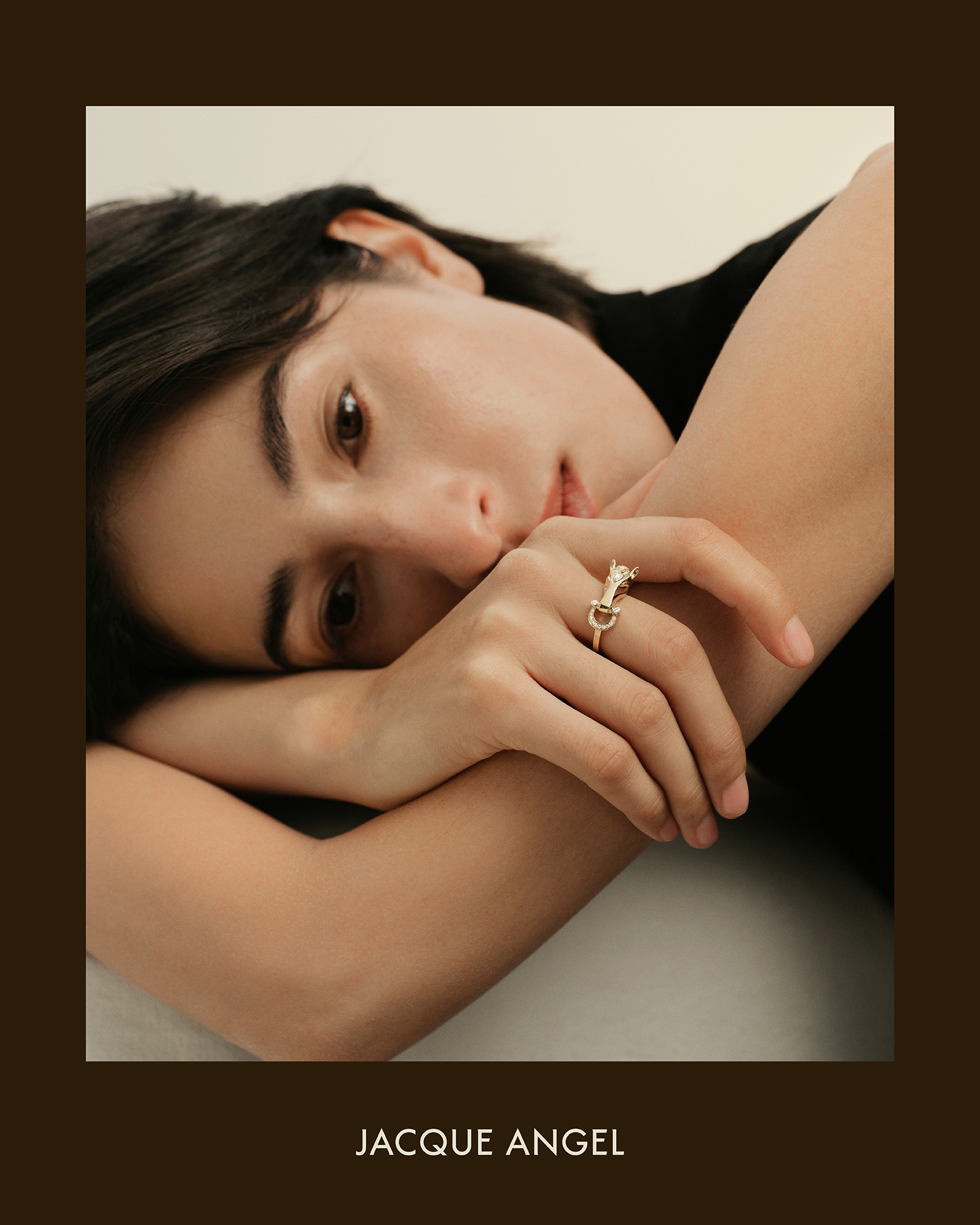
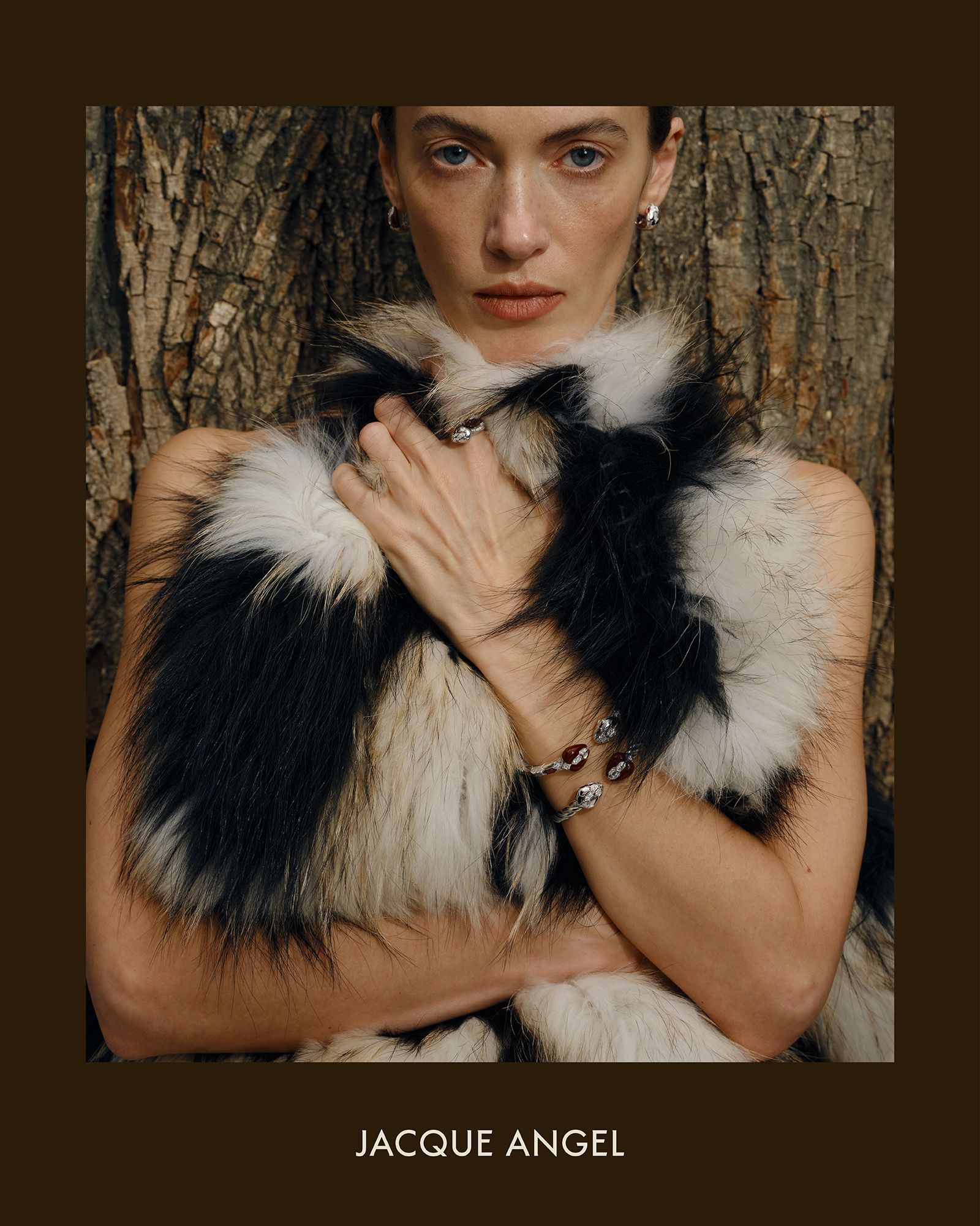
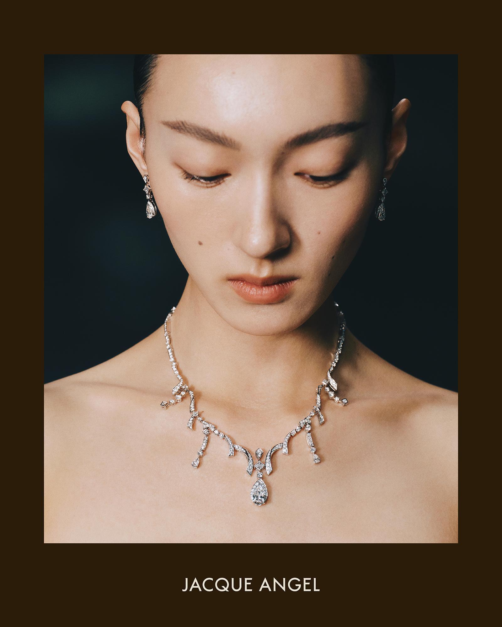
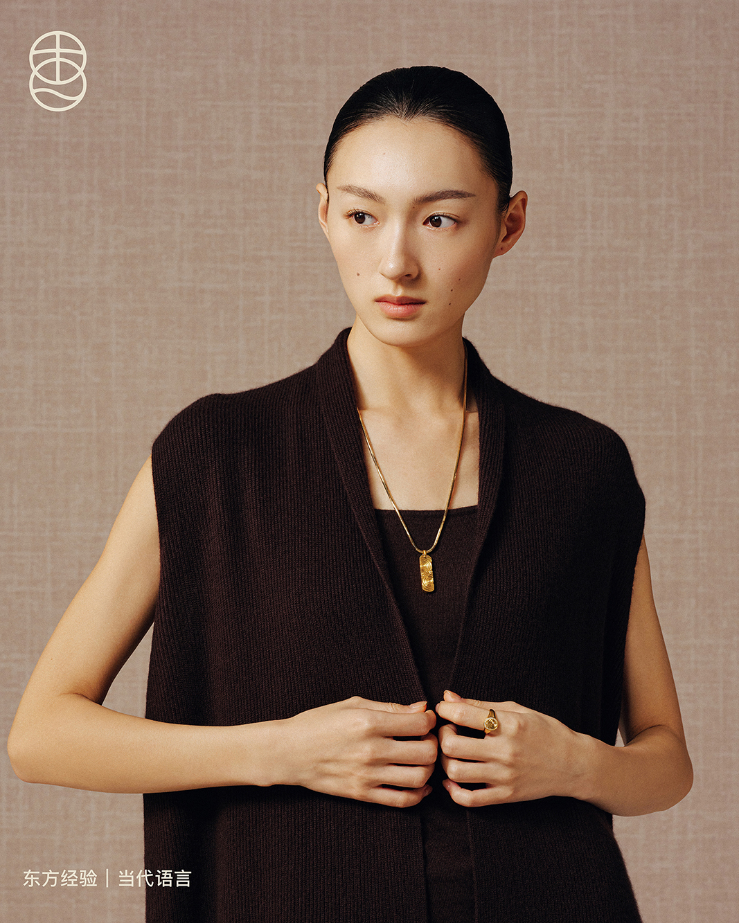
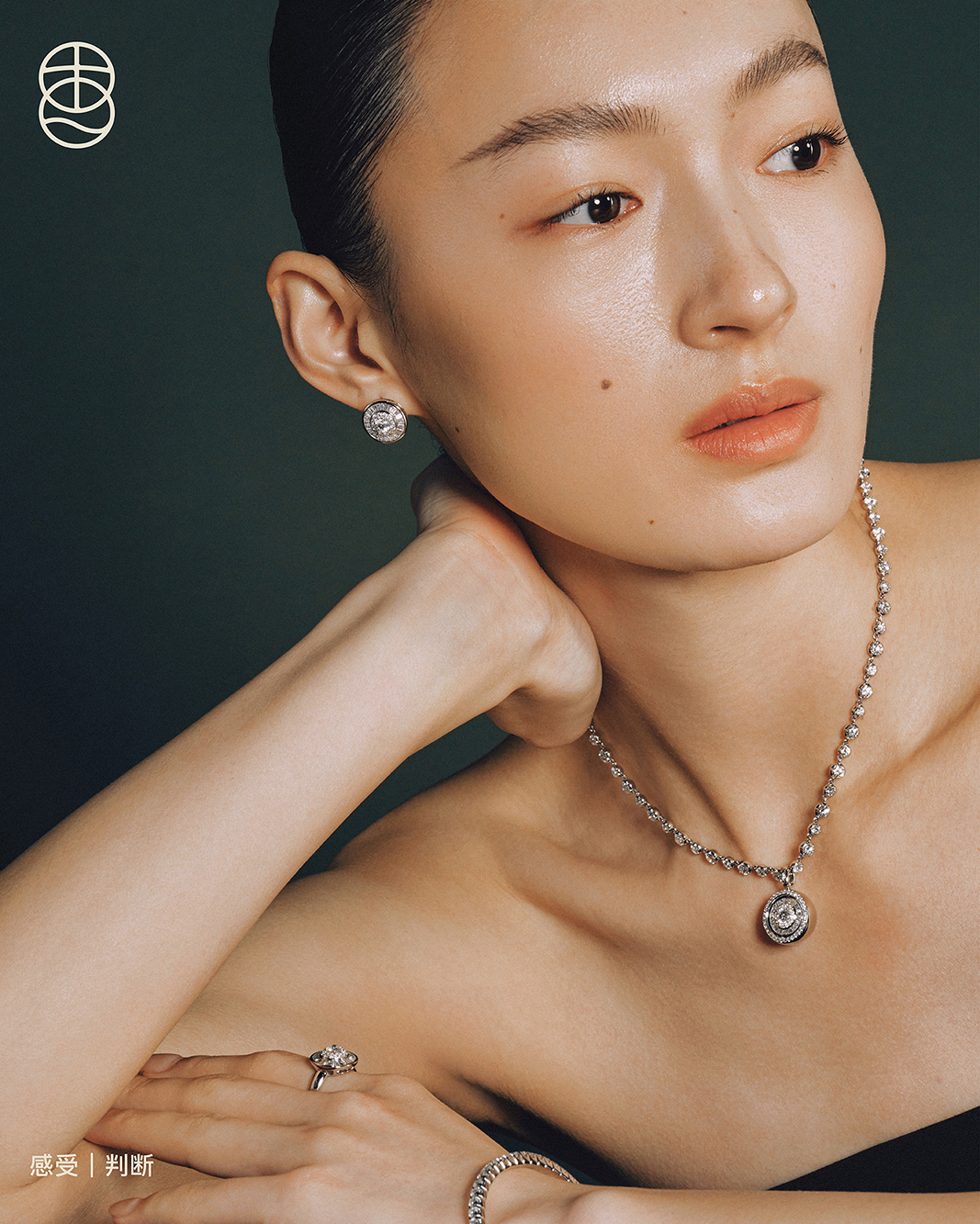
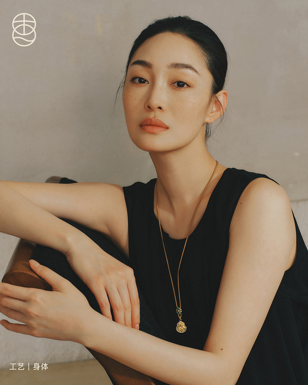
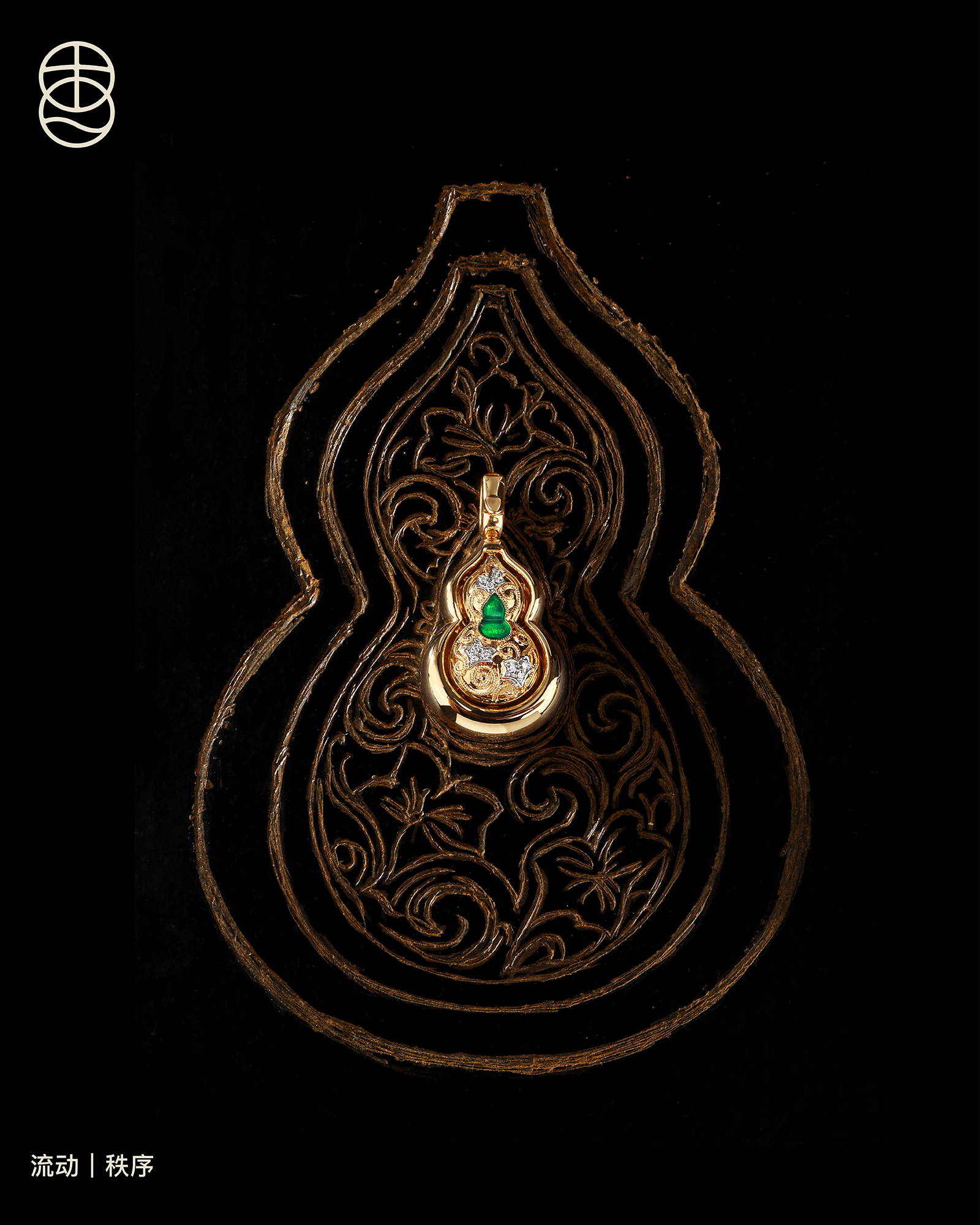
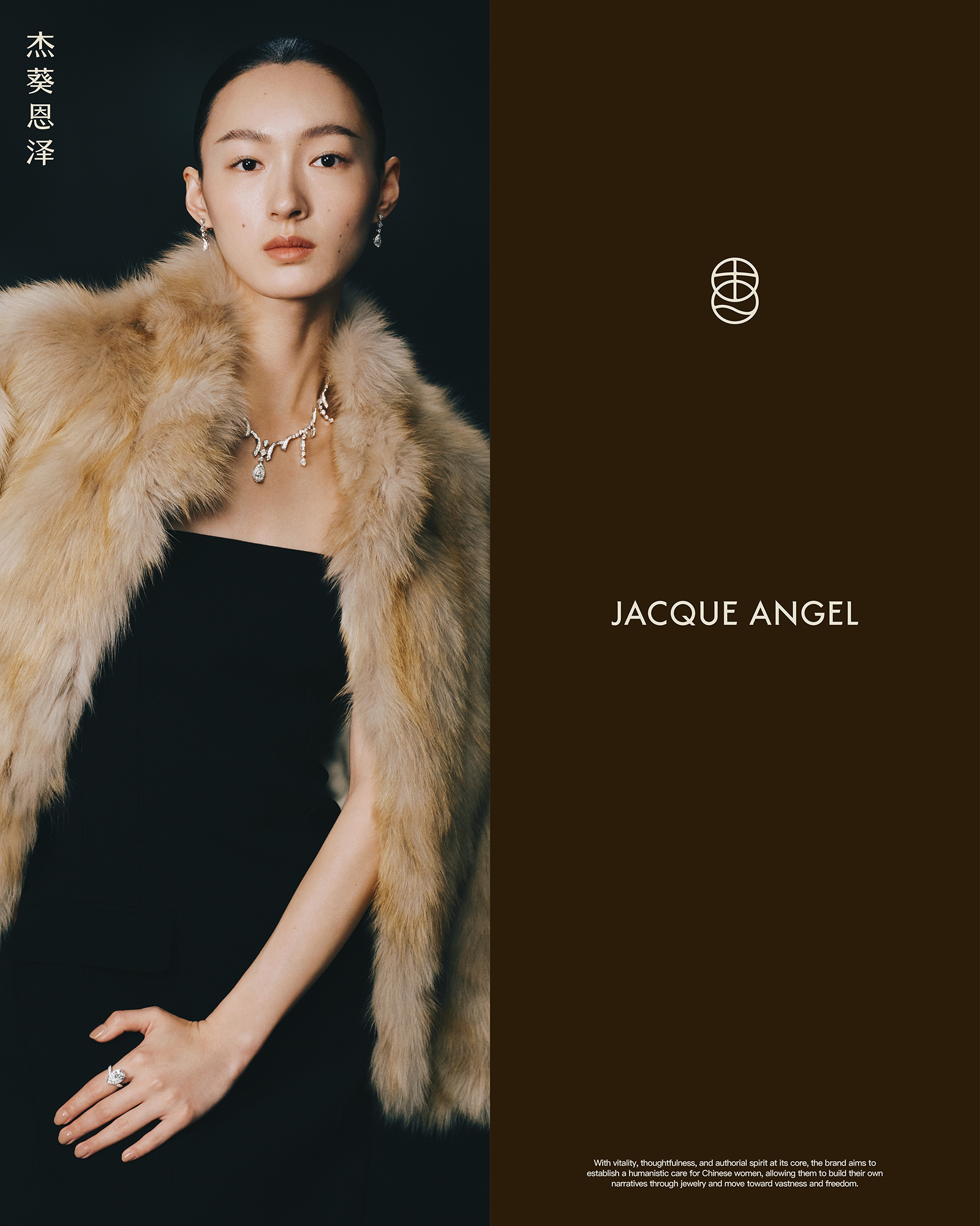
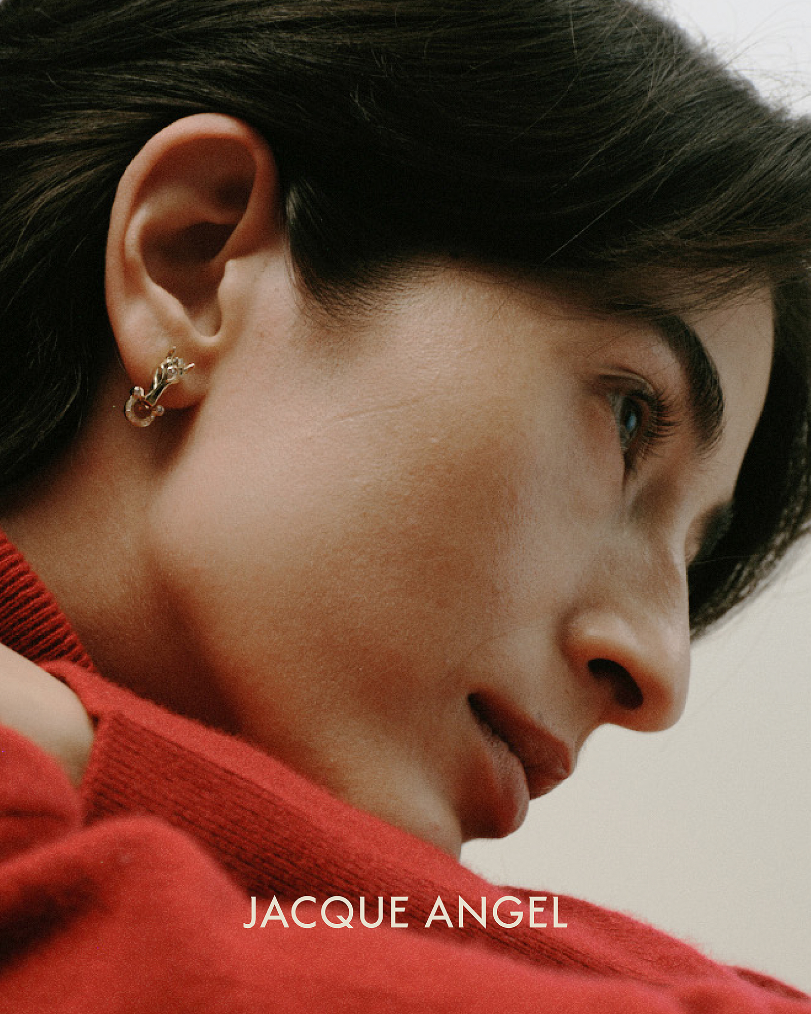
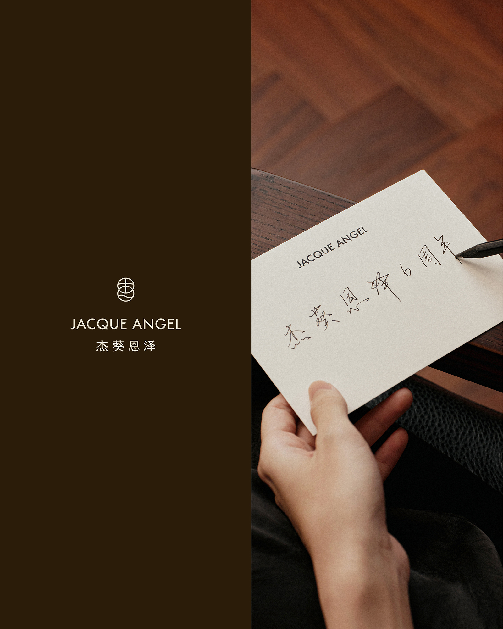
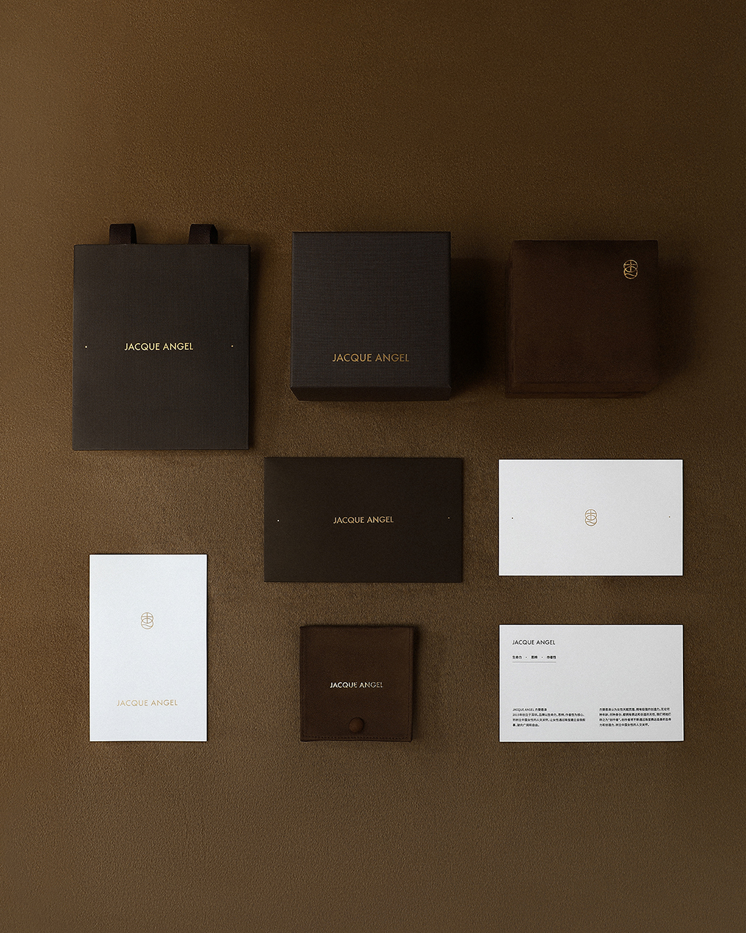
The new version of the logo system consists of a combination of English characters, Chinese horizontal characters, Chinese vertical characters, and graphic logos. JACQUE ANGEL is the official English name of the brand. The Chinese "Jie Kui Enze" is not just an ancillary translation of the English character sign, but the official signature of the brand in the Chinese context. Different versions will enter packaging, content, social media and offline space based on space, identification distance and information level. It's not just one sign that has changed. Character images will pay more attention to the real state, physical relationships and personal experience; product images will make the structure, surface, luster and wearing relationships the protagonists; the layout will retain order, boundaries and sufficient blank space; the text will remain restrained, specific and judgmental.
Q7| Regarding color, what belongs to JACQUE ANGEL?
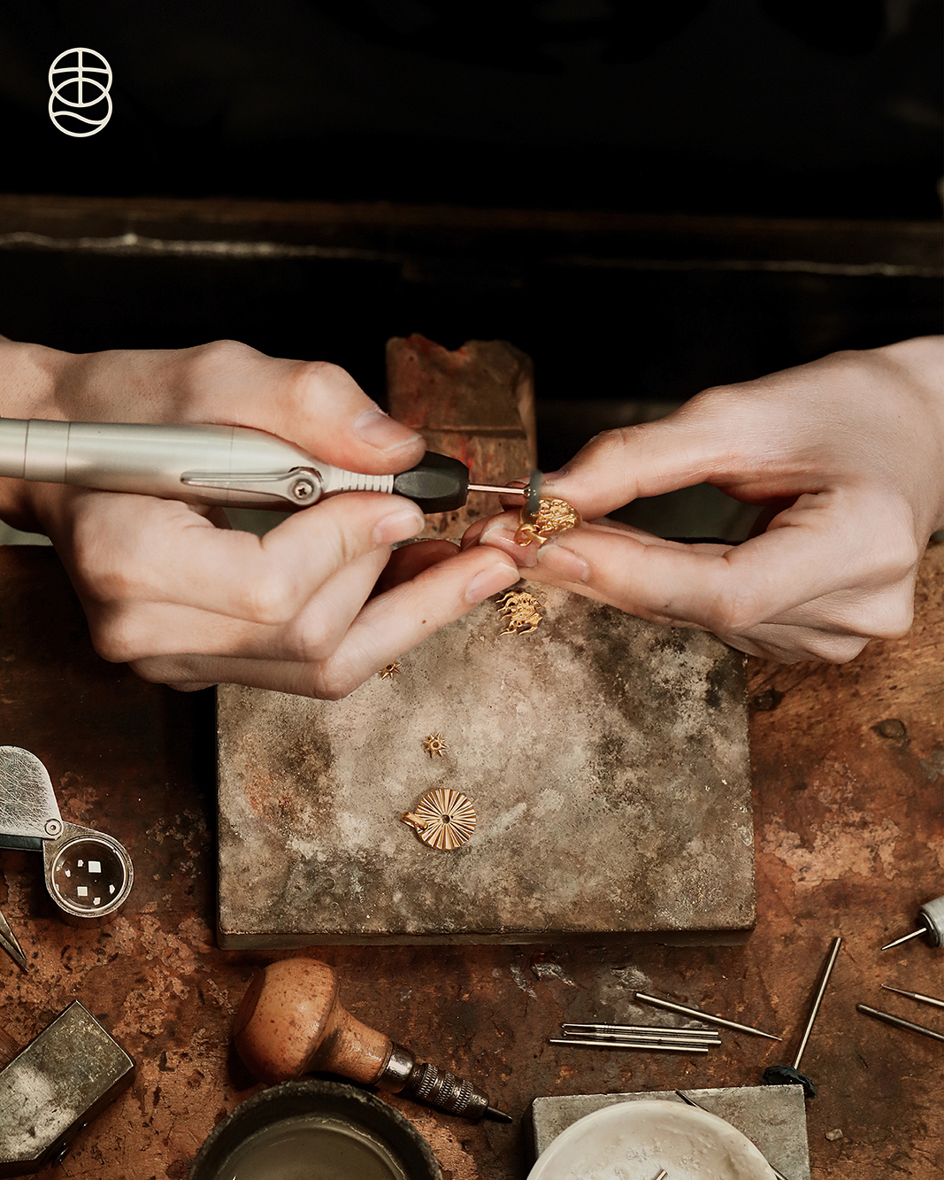
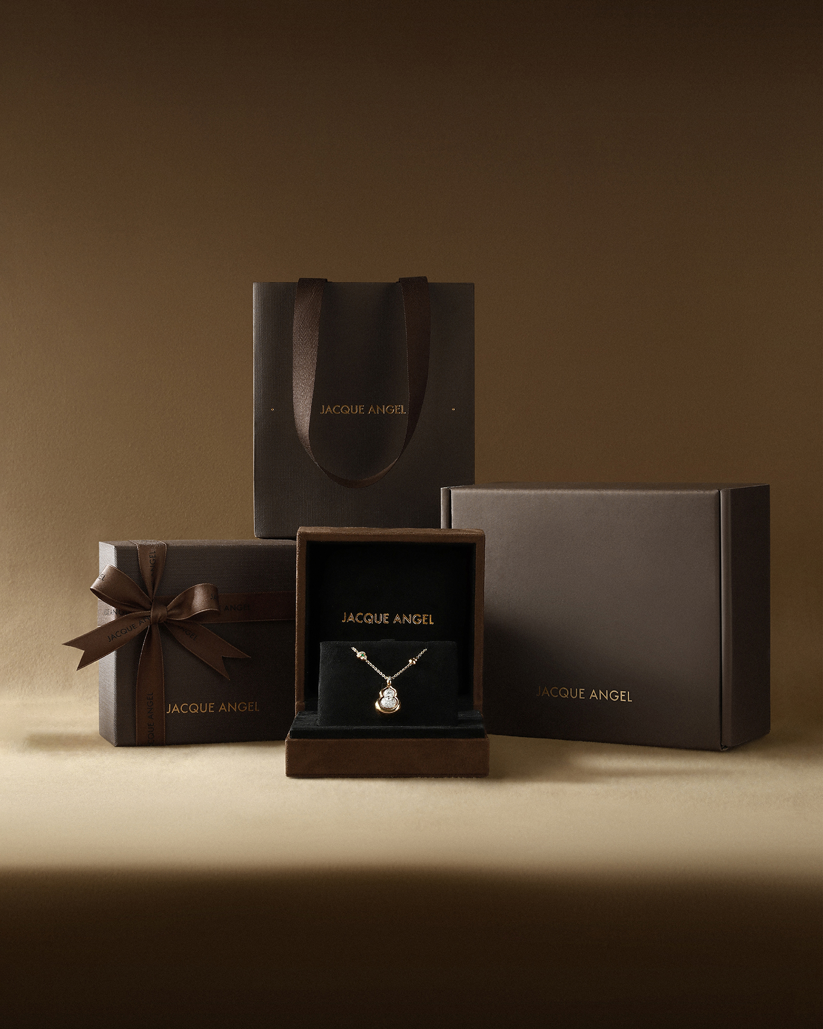
If you want to find a color for JACQUE ANGEL, it should not only express the light of jewelry, but should also be able to inherit the time, judgment and human experience behind the light. What we finally chose was a set of brand colors consisting of dark brown, warm brown and soft rice white. They are not eager to attract attention, nor do they use intensity to create distance. They are more like the temperature left by jewelry being touched repeatedly, like the creative traces preserved by m*cripts, materials and workbench, and like the internal order gradually formed after a person experiences changes. Brand main color: A dark brown that is close to black but retains temperature. This is a color with a concentration close to black, with a brown tone on the bottom layer. Black brings clarity, order and judgment, while brown retains the temperature of the land, time and handmade materials. It is stable but not cold; deep but does not prove its value with a sense of distance. The name "JACQUE ANGEL" comes from the image of the vibrant sunflowers growing on the land of Enze. Deep brown does not directly depict flowers, but returns to the land that supports life's growth: quiet, solid, capable of carrying change, and allowing different life experiences to occur from it. It corresponds to the "speculation" and "authorship" in brand values: to maintain judgment amidst the numerous voices, and gradually confirm one's own boundaries amid changes. As a long-term signature of the jewelry brand, it also provides a stable background for gold, diamonds and colored gemstones, allowing the material, structure and luster of the work to be clearly seen without competing with jewelry for attention. Warm brown auxiliary color: Let the touch of time and people enter your vision. It is close to the warm color of skin, wood, paper and metal after precipitation over time, and can connect the preciousness of jewelry with the authenticity of daily wear.
Q8| Where will the new identity meet us?
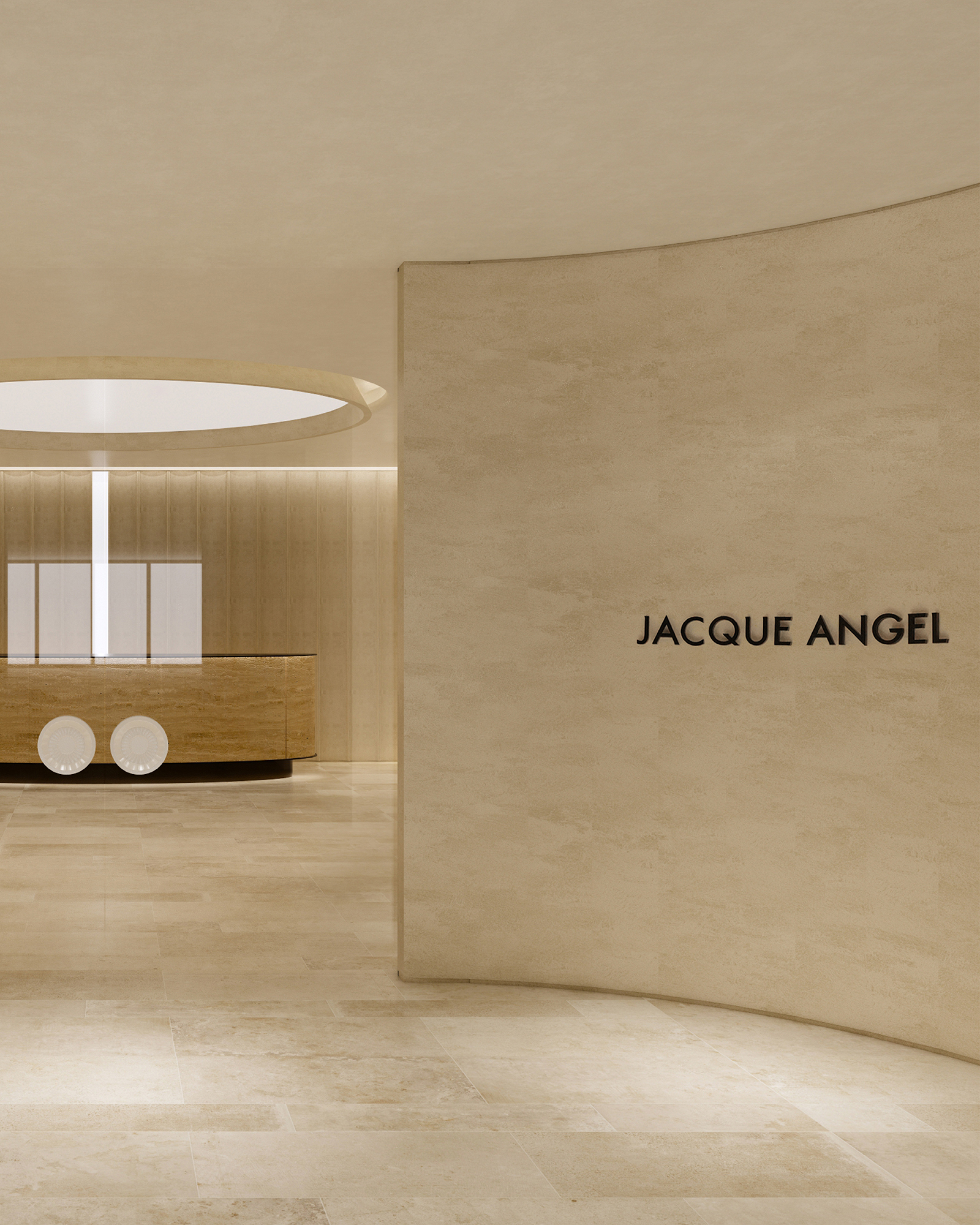
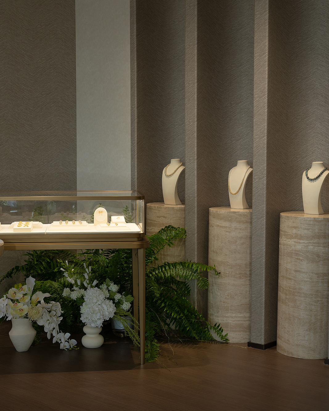
The new VI will gradually enter products, packaging, content, space and services. It not only allows the public to recognize a name, but also allows people to feel the same clarity, sincerity and understanding in every viewing, try-on, selection, delivery and long-term companionship. In August 2026, Shenzhen offline space was officially opened to the public. This is both a daily office space and a place where works are discussed, revised and completed. The new brand identity will also become the long-term signature of creation, display, communication and service in this real space.
Q9| What do we hope to continue to do in the next period of time?
The new brand identity is part of three long-term upgrades to JACQUE ANGEL. In terms of brand identification, people can recognize JACQUE ANGEL and understand the femininity, aesthetic and spiritual stance we represent; in terms of product value, let each work answer why it exists; in terms of customer experience, let the brand and The relationship between people is not just one transaction, but extends to recognition, understanding, trying-on, selection, delivery, maintenance and long-term companionship. Jewelry does not give meaning to a person. It gives the choices, arrivals and transformations that have taken place a shape that can be worn. The sixth anniversary is a new signature and the beginning of continued growth.